With my previous blog post about scoping rules (check it out here!) turning out to be a popular success I wanted to take scoping rules one step further – to applications! And what is the easiest and fastest way to make an interactive application for a user in R? You guessed it! SHINY!

For those not familiar with using Shiny to create applications there is good documentation on RStudio’s website with the start of a showcase gallery as well. I’d suggest you check out the documentation and give your first Shiny application a try – you’ll be hooked! If a picture is worth 1000 words, an interactive application is priceless! Especially when you can give your customer, users, boss, etc a great experience around the analytics work you have spent so much time on! The ooh-ahh factor is not just nice-to-have, it’s really essential to making sure your audience understands your results!

Enough about why you should try out Shiny! For initial users of Shiny creating an application is a generally straightforward process to get good results. The great part about this is that you don’t need to worry about scoping right away since you are the only user of your application. However, once you start creating more applications in Shiny you will start to deploy them to a Shiny server, and have (potentially) more than one user per application and you certainly don’t want your users colliding with each other! This is when scoping becomes critical!

Scope Figure

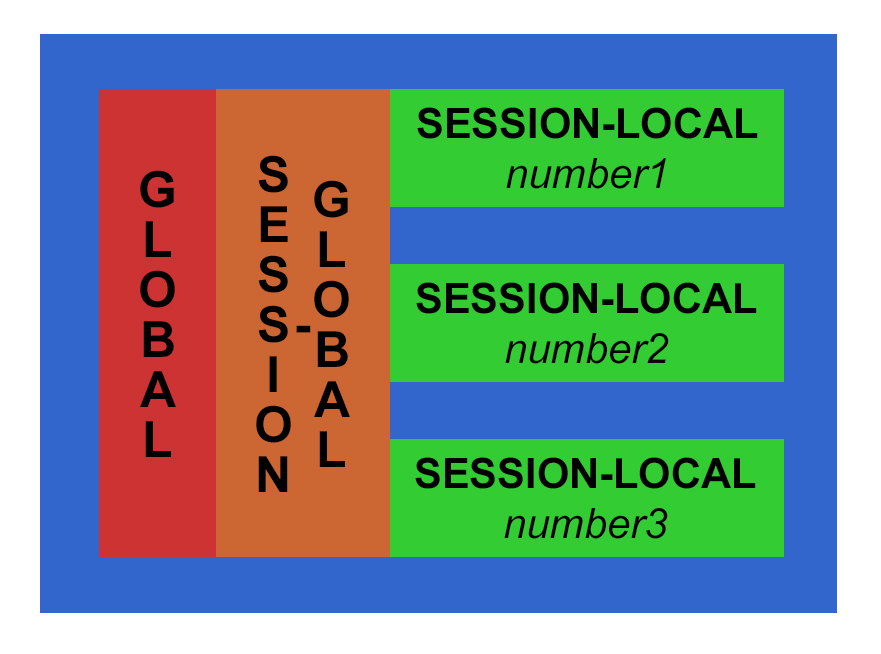
There are three main scopes in a standard shiny application – the global, session-global and session-local scopes.

The global scope, which is the easiest to understand (and most dangerous to use)! Anything declared within the global scope is accessible to both the UI and Server sections of the application as well as inside and outside the session scope. The only way to declare a globally-scoped variable in a shiny application that is not a single file is to use the global.R file. Luckily this makes it obvious what scope anything in this file is in!

The next most common scope is session-global. This is a nearly-global scope and in a standard two-file (session.R and ui.R) shiny application this is the most (or closest to true) global scope you will encounter. In this scope declared items are visible to all R server sessions. There is no differentiation between users; all users receive, can see, and can use or change these items.  The most appropriate reason to use this scope is for items that are globally relevant and generally do not change based on users or their input, such as reference data sets or functions for processing user data. There isn’t a need to duplicate a reference data or processing functions for each user session, so declaring these types of items in the session-global scope is appropriate. However, I often find that beginning developers tend to declare variables in this scope because it is easy – you can access and use your variables and functions anywhere in the session.R file…

Some of the downsides to mis- or over- use of the global and session-global environments include:

  • Environmental pollution (and usage collisions/conflicts)
  • Data/Security exposure issues (all user sessions get these global values!)
  • Memory cleanup issues

These three items can be extremely hard to track-down and fix in a large application, especially once you have multiple application users and/or multiple interconnected applications.

So consider using the most localized scope whenever possible: the session-local scope! This scope is limited to a single shiny application session. Unless your application does some very fancy footwork, it is possible for the user to create multiple sessions of an application, so this scope is limited by session, not just user. Within that application session anything changed, updated, used, etc. does not affect any other session – and this is usually what you want in your application! One user’s inputs, workflow, changes, etc. do not affect any other application user. This scope should be where the majority of non-reference objects and functions should be declared and used.

It is difficult to illustrate the adverse effects of misusing the global and session-global scopes without a number of simultaneous users of a shiny application. However these scopes apply no matter how simple, or complex, your shiny application. To illustrate where these scopes are I started with the familiar sample Observer shiny application (from RStudio) and made some modifications to illustrate scope in a simple manner. You can copy-paste the code into your own .R files and run it or download the three files using the button below (which are better spaced and well commented) to run the application. This application uses three variables scoped as in the discussion above and illustrated using the matching three colours below.


global.R

i.am.global <- \"GLOBALLY defined\"


ui.R

fluidPage(
  titlePanel(\\\"Observer   Scope demo\\\"),
  fluidRow(
    column(4, wellPanel(
      sliderInput(\\\"n\\\", \\\"N:\\\",
                  min = 10, max = 1000, value = 200, step = 10)
    )),
    column(8,
           verbatimTextOutput(\\\"text\\\"),
           hr(),
           p(em(\\\"In this example, what\\\'s visible in the client isn\\\'t\\\",
             \\\"what\\\'s interesting. The server is writing to a log\\\",
             \\\"file each time the slider value changes.\\\"))
    )
  ),
  fluidRow(
    column(12,
           br(),
           p(\\\"The below values are the various scoped varibles in the app:\\\"),
           p(pre(paste(\\\"i.am.global =\\\", i.am.global)),
             htmlOutput(\\\"sessionglobal\\\", inline=T),
             htmlOutput(\\\"sessionlocal\\\", inline=T))
    )
  )
)


session.R


## ---------------------
## SCOPE - server-global
## ---------------------
## Anything declared here is visible across ALL sessions of the application
## NOTE: changing this value requires <<- or an environment usage - if you 
##       see <<- in a shiny app it is often because someone is changing a
##       global or session-global variable!  This changes it for ALL sessions!
i.am.session.global <- 0


function(input, output, session) {
  ## --------------------
  ## SCOPE - server-local
  ## --------------------
  ## Anything declared here is only visible within this session
  i.am.session.local <- 0
  
  logfilename <- paste0(\\\'logfile\\\', floor(runif(1, 1e 05, 1e 06 - 1)), \\\'.txt\\\')
  
  obs <- observe({cat(input$n, \\\'\\\\n\\\', file = logfilename, append = TRUE)})
  
  session$onSessionEnded(function() {
    obs$suspend()
    unlink(logfilename)
  })
  q
  output$text <- renderText({
    paste0(\\\"The value of input$n is: \\\", input$n)
  })
  
  # SCOPE EXAMPLE
  observeEvent(input$n, {
    # when n changes update the local value to the n\\\'s value
    # and ADD 1 to the server value
    i.am.session.global <<- i.am.session.global   1
    i.am.session.local  <- input$n
    
    output$sessionglobal <- renderUI({HTML(\\\"< pre>Count of times n changed - all sessions:< b> \\\", i.am.session.global, \\\"< /b>< /pre>\\\")})
    output$sessionlocal <- renderUI({HTML(\\\"< pre>Current value n - only in local session:< b> \\\", i.am.session.local, \\\"< /b>< /pre>\\\")})
  })

  
}

## ---------------------
## SCOPE - server-global
## ---------------------
## Anything declared here is visible across ALL sessions of the application
## NOTE:  It is very infrequent that code is placed below the main 
##        function of a shiny application, but if it is this is again in
##        the server-global scope


You will notice that the code purposely changes the session-global variable from within the local session – so if you open up the application in multiple browser windows you can change the session-global variable and see how it does affect all sessions, not just the one open window. The session-local variable only affects the local session, and the overall-global variable is included to show you how declared items in “global.R” can be used in the application if desired.

Explore and change the sample app so that you can get a good feel for the different shiny scopes.  If you can – open two different browsers or tabs with the application and see how your changes in one session affect the other sessions and vice-a-versa. A solid understanding of these three scopes in a shiny application will really help your development in the future be more professional, consistent, and solid!

Download the Example Scoping Shiny Code Here


Let’s say that you have a growing technology shop, such as for analysis and development, or that you’re establishing a new team. In short order, you’ll become concerned with matters such as ensuring their timely delivery, quality targets, and readiness for a competitive and ever-advancing technology landscape. In other words, you’re going to need some kind of technology leadership. Enter the technical leader!

What is a Technical Leader?

I’m glad that you asked. Technical leaders are charged with the timely delivery of high quality results to the customer. Results can be varied, such as software or training, but invariably they meaningfully produce value and require the investment of skill and time that only a team can provide.

The idea of technical leaders is not new, having been adopted from other engineering industries into the modern technology domain; however, the manner in which a technical leader adds value is often misunderstood. In this post, I am going to explain why you should have a technology leader and what you should expect from him or her to ensure that you get the most out of both the role and the team.

Fundamentally, a technical leader is a facilitator: they balance the customer’s vision with what the team can achieve (within organizational tolerance and contributor ability). That means they will be constantly ensuring everyone’s understanding of how the job needs to be done and which aspects of the job need to be done at all points in the delivery cycle. It’s all about logistics and knowledge sharing.

Let’s start with communication.

It’s imperative for teams of any kind, and especially those doing technical work, to be able to quickly and succinctly impress upon their peers, partners, and customers their challenges and needs. The topics are broad: feature and schedule discussions with the customer; data exchange and component behaviour with partners; and with peers designs, quality benchmarks, capability constraints, location of work, and more. The technical leader must constantly refine everyone’s ability to signal and exchange in a conceptually uniform manner. Easy wins are common programming and spoken languages, but what about design patterns, pseudo code, and functional demonstrations? Even the names and positions of branches and tags within version control systems indicate a state of activity, concern, and acceptance among team members. All of these variables, business and technical, need to be streamlined and standardized by the technical leader so that the team spends more time doing things for the customer as opposed to determining what needs to be done. A good technical leader will use every opportunity, from hack-a-thons to code reviews, to ensure that their team members, customers, and partners can effectively exchange ideas in manners suitable to their environment.

When a team communicates effectively, everyone will be eager to start doing things. It’s great when those things result in a delivery satisfying the customer’s intention, but not all decisions made by individuals will jive with the realities of the business or team. The technical leader needs to be regularly available to the customers, partners, and team to ensure that decisions are accounting for the potential of the situations at hand. In effect, the technical leader needs to be the best connected person on the team, sufficiently aware of the political, resource, talent, schedule, and technology realities of the day. The technical leader will ensure, for example, that the most capable individuals aren’t introducing ideas that cannot be carried by the team’s average skill-to-bandwidth ratio; and that code being prepared by each team member is of sufficient relevance to the critical path.

Obstacle Removal

A key aspect of decision support is obstacle removal, and this effort in various forms will be the core of the technical leader’s daily activity. An astute technical leader will spend significant time evaluating (in advance) the skills, tools, and access carried by the team. Such insight will permit the technical leader to do things such as rotate junior members into appropriately challenging situations to increase their potential; advocate for aligned training plans; and establish systems or permissions relevant to a high quality delivery. When funds fall short or new information arises impacting the path to success, the technical leader needs to provide educated instruction to members so that they can proceed or involve the proper authorities who can make the necessary call. In agile environments, the technical leader has the responsibility of forcing recommits by customers and sponsors if the landscape changes so sufficiently that the team cannot produce any reasonable value. Not least, there will be many instances in which members will want to tackle work that seems, at face value, productive, but in reality does not contribute to the immediate needs of delivery; or would result in unnecessary risk to the project due to an incomplete knowledge or availability by those who would become involved in seeing the solution through to completion.

When it comes to less experienced members, the technical lead assists by researching, demonstrating, and closely guiding how work should proceed. That doesn’t mean that they do the work of the junior engineers, but rather that the lead sets the context for productive progression. For example, the technical leader might prepare a series of unit tests that exercise the API of a new framework so that the team gains a living example of how best to use the functionality. Or, a test framework might be prepared illustrating the lead’s desired outcome for component interactions. In many respects, the technical leader will always be one step ahead of the team by participating in or making use of technology radars, conferences, journals, industry peers, defect lists, and similar to ensure an awareness of options that can result in better deliveries for the customer. The lead will also establish a sufficient learning environment so that the team can make use of new options without the risk of mistakes and delays along the critical path.

Are they the most practiced?

Clearly the technical leader is going to be a team expert, familiar with many tools and tactics for getting the job done. It might surprise you to learn, then, that despite the critical role played the technical leader will probably not be the best programmer or analyst on the team! It’s true, and it’s an important fact for organizations to remember when managing their teams. While the technical leader will be competent, experienced, and wise, the fact of the matter is that they need to split their time between concerns such as feature specifications, user story specifications, engineering metrics, team member environment optimization, business interlock, customer interlock, and more. That means, for any kind of balanced life, the technical leader is going to do less coding, less modelling, and less testing than his or her peers. In other words, they might well be experienced, but they’re going to end up being less practiced.

Don’t panic, especially if you happen to be a technical leader. It’s okay, and in fact it’s an acceptable trade of implementation productivity. In the balance between getting things out the door and into the customers hands versus running the business, the technical leader offers wisdom and refined decision making in the context of external pressures so that the rest of the team becomes more productive. If the technical leader simply coded alongside everyone then the team would be, well, the team + 1 with just a linear increase of productivity instead of factoral leaps. It’s similar to having an engineering manager: they don’t (or at least shouldn’t) code with the team, instead they deal with human resources, budgets, policies, and the translation of business strategy into tactical outcomes. The work needs to be done regardless of whether it is hidden in the team or tackled directly via a supported mechanism.

Balancing Act

But less practiced means less experienced at some point, right? Yes, unfortunately. As Stephen Covey once noted, a sharpening of the saw must occur. This can be achieved either by having the organization invest in training time and resources for the technical leader, or the organization can adopt a rotational model by which different people share the burden. An example rotation strategy is to use a primary-shadow-worker approach by which for a period of time an individual acts as the technical leader and has the part-time assistance of a team peer. The part-time peer, known as a shadow, helps the technical leader such as by doing research or grooming the backlog, and in so doing remains aware of the overarching concerns for the team. At the end of the period, the technical leader transitions into a traditional engineering role within the team, the shadow becomes the new technical leader, and one of the team engineers steps up to be the next shadow. The length of period depends on many things, but for agile teams the feature commit cycle can be a good alignment. The result will be a balanced, self-enabling technology team capable of succeeding in many challenging situations.

In all, technical leaders are vital to healthy and productive teams–but to be the most effective these individuals need to exercise their engineering prowess by focusing less on implementation and more on communication, logistics, and knowledge sharing. Organizations need to recognize that the value of these activities are critical to successful outcomes, and by promoting strong technical leaders they gain the benefit of strong delivery teams.

Whether you are a veteran programmer with experience dating back to Fortran, or a new college grad with all the latest technologies, if you use R eventually you will have to worry about scoping!

Sure, we all start out ignoring scoping when we first begin using a new language. So what if all your variables and functions are global – you are the only one using them, right?!?! Unless you give up on R, you will eventually grow beyond your own system – either having to share your code with others, or deliver it to someone else – and that’s when you’ll start to need to pay attention to your code’s quality – starting with scoping!

Let’s get started at the beginning of the R coding experience. When you execute R on the command line generally everything is added to the global scope – and this makes logical sense. Little changes when you program in a .R file – it’s just a series of commands that are executed one by one, but as your sophistication of code increases exponentially you will want and need to use functions for reusable code pieces. This more granular scoping is ideal as your codebase grows!

Basic scoping rules in R

Variables and Function Definitions

  • By default, they are added to the Global scope.

Inside a Function

  • Variables passed into the function as inputs are visible by default within the function. Variables defined in the parent scope are not visible, but globally-defined variables are visible. If the parent scope is the same as the global scope – those variables will be visible!
  • Variables created inside the function are local to that function and it’s sub-components, and NOT visible outside of the function.
  • Each invocation of a function is independent, which means variables declared and manipulated inside a function do not retain their values
  • Arguments are immutable – if you change the value of an argument, what you are actually doing is creating a new variable and changing it. R does not support “call by reference” where the arguments can be changed in the called function and then the caller can use the changed variables. This is a very important difference from other languages – in some ways it makes your code safer and easier to debug/trace and in other ways it can be inconvenient when you have to return several of values of different types.

General

  • Brackets {} do not create reduced or isolated scopes in R

Seems straightforward! However there are two big gotchas – automatic searching and double-arrow assignment misuse.

Watch OUT for these Gotchas

  • Automatic Searching

    R uses environments that look like nested trees. When a variable or function is not found in a particular scope, R will automatically (like it or not) start searching parents to find the variable or function. R then continues searching until reaching the top-level environment (usually global) and then continues back down the search list until reaching the empty environment (at which point if a match hasn’t been found your code will error)

    This can be dangerously unexpected, especially if there is a critical typo or you like to reuse variables (like x). You can download and run the example code to see this in action.

    One of the best ways to double-check your functions for external searching is to get in the habit of using the codetools::findGlobals function. When you have created your function, and you’re pretty convinced it is working, call this function to get a list of all external dependencies and double-check that there isn’t anything unexpected!

  • Double-Arrow Assignment Misuse

    Another “gotcha” is the double-arrow assignment. Some users assume incorrectly that using <<- will assign a value to a global environment variable. This is not completely correct. What happens with <<- is that it starts walking up the environment tree from child to parent until it either finds a match, or ends up in the global (top) environment. This is a way to initiate a tree-walk (like automatic searching) but with dire consequences because you are making an assignment outside of the current scope! Only the first match it finds will get changed, whether or not it is at the global environment. If you truly need to assign a variable in the global environment (or any other non-local environment) you should use the assign function (assign (“x”, “y”, envir = .GlobalEnv). Ideally you should return the value from the function and deal with it from that other environment.

If you understand and follow the above you will be well on your way to ensuring correctly scoped variables and functions in your R code. Yes, there are mechanisms for hiding variables and getting around the standard scoping and restrictions in R. However, once you are comfortable with the basics you’ll be able to properly deal with these mechanisms – we’ll leave that set of topics for another day and another post.​

I’ve written a commented R script if you would like to see examples of the above scoping rules as well as the gotchas in action. Feel free to download and use it as you see fit!

Resources

To measure, or not to measure…

Big data, small data, everywhere there’s data! …But how BIG is “Big Data”?

Could we please STOP focusing on this ridiculous problem – the semantics of how big is “BIG”. Yes, data has exploded recently, and our world is filled with more and more data, data capturing devices, data analysis, etc. But why do we care so much about categorizing the data into “Big” data buckets? We are often so focused on how big the data is that we don’t get much further than finding new and more accurate ways to measure the size of the bits and bytes, Funnily enough, the size of any particular data agglomeration is actually meaningless except in a geeky data one-upmanship contest.

Do I, as an active data scientist and coach, define and explain “Big Data” to my clients? How do I accurately judge an analytics problem to figure out appropriate tools and architecture solutions?

Strangely enough, I don’t ask if they have “Big Data” – here’s how the conversation goes:

Me: Do you have access to the data?
Client: Yes

Me: Awesome! Sometimes this is actually the hardest part of a project

Me: What does your data look like? Where is it stored? 
Client: My X (usually outdated) system or flat file 
Me: Ok, I can work with that.

Me: How much data do you have?
Client: Um, oh, well, ...
Me: Is it 10Mb, a GB, a TB, etc? How many tables, or rows and columns, approximately? 
Client: Oh, it's about 100Mb. I know it's not big data...
Me: That's a great size!
Me: How many records or fields? 
...

You may have noticed how quickly the apologizing started about data size. This happens frequently in my experience, regardless of how big or small a client (or their data) is. I spend a good amount of time at this point assuring every client that yes, I can still work toward some awesome analytics goals regardless of their data size.

Did you know: it only takes ~30 observations in a good dataset to be able to perform certain statistical tests? Now, for a rare disease, 30 patient instances might actually be pretty large, but in most of the modern data science applications there are many more observations to work with. A 1Mb text file contains approximately 1 million characters. Let’s say there are nine 10char fields and nine commas on each line, this file then contains ~10,000 observations – more than enough to do most (if not all) modern statistical tests!

Wait - are you telling me that 30 observations is big data?!

No, I am pointing out that it could be ‘significant’ data, or data that can be used to perform an analysis that has statistical significance. There are many caveats as to whether or not the power equation will suit the analysis purpose with a very small sample size. I am telling you that it is possible for very small data sets to (potentially) provide a statistically significant analysis result.

So before you start apologizing for the ‘size’ of your data think about it this way:

  • What is the analysis you want to do?
  • Do you have “enough” data?
  • Do you have “too much” data?
  • Do you have a data “problem”?

The hype buildup around big data is really leaving out a key term ‘problem’. Do you have “Big Data” should really be Do you have a “Big Data Problem”. What’s a Big Data Problem? It’s ultimately any size of data you can’t reasonably handle in a way you need to – which means different things to different people. I believe the term ‘big data’ might even have stemmed from excuses for systems that couldn’t handle a change in data volume or flow.

Consider the following scenarios:​

  • Someone at IBM or Cisco or Bell might have a “Big Data Problem” analyzing the packets from entire countries of network operations – so much data that is coming so fast that they can’t handle the throughput in a reasonable time to take action on repairing infrastructure hardware.
  • A retail store might have a “Big Data Problem” because they have 10 years of store transactions stored in excel spreadsheets at each retail location in different formats. The data is messy, disconnected, and likely too large for their tools.
  • A successful mom-and-pop bakery might have a “Big Data Problem” handling their inventory and sales forecasting using their one big spreadsheet they have collected for years and that now takes 20 minutes to open on their computer!
  • A third-world doctor’s group might have a “Big Data Problem” crunching imaging lab results using their cell phone – which is the most ubiquitous computer in remote areas. However a cell phone is only a small computing device and can’t really hold onto lots of data or perform intense calculations.

All of these have a common thread: data. The comparative size of the data actually doesn’t matter – is the mom- and-pop bakery’s data not important because it still (barely) fits into a spreadsheet? Should we discount the need to analyze lab results using cell phones in third world countries because the data is only a few images worth? Are only the “big” players with terabytes of data the ones with data problems? No.

Data Science needs to address all of these types of data problems, and ultimately it doesn’t matter how big each scenario’s data is – it is “too big” for their use case, and causes them a data problem.

So let’s agree to stop measuring our data and looking to compare sizes like some set of school kids in the locker room! Let’s continue to solve “data problems” regardless of size so that greater value can be derived from datasets. We need to focus our energy on creating the techniques, tools, and solutions that will answer the endless stream of questions we want to investigate using the plethora of data that exists in our world today.

3 Different Types of Analytics Project Teams and
3 Questions for How to Get to Innovation Faster

Guest Post by Rosemary Hossenlopp

Running an analytics project is not like any other project. There are only a handful of organizations who are running data projects that link data-driven initiatives to corporate innovation goals. This shows that knowledge on how to run a Big Data project isn’t widely understood by most companies. Analytics projects also fail more than other projects so there are risks which most organizations ignore in their haste to get into the data-driven project space. Who says so?

Few Organizations Have a an Analytics Project Process or Plan

According to PwC, a consulting firm powerhouse, only 4% of companies have an effective data strategy. So doing the nonquant-intensive math, this means that 96% of global organizations neither have a process, nor a plan that allows them to use their data assets for competitive growth or internal improvements. To See this Sad Math Summary, click here.

Most Analytics or Big Data Projects Fail

According to Gartner, most projects fail as projects are treated just like any other project. To see this Second Sad Summary, click here.

Analytics Teams Must Understand The Next Big Step to Take

Before this post starts to sound like the opening night of the United States Republican Convention which was touting and trumpeting (pun intended) doom and gloom, there is a path and framework for teams to quickly see how to strategically move their teams to faster launches by understanding Which Type of Analytics Project They Are On. Who can analyze their organization to understand their Big Data Project Type? The likely role suspects would be Project managers, Product Owners, Engineering leaders, Project Management Office (PMO) leaders. Yet first, why should Analytics Project Teams assess their Project Environment?

Benefits For an Analytics Team to Understand Their Current Project Type

Leadership has high expectations for Analytics and Big Data teams to produce results. So teams focus on getting to the next sprint demo rather than stepping back and seeing if there are hidden organizational issues that will trip them up on their way to launch success. In the old engineering days, we called this an undetected defect. Now we need to apply the same focus on finding and removing technical bugs to looking for process and planning steps, that if skipped, will tank your project.

What are the benefits of assessing your Big Data Project Environment?

  1. Increase time to value – avoiding missteps in process & planning will prevent politics and push back at project launch.
  2. Increase team motivation – technical execution is terrific yet ultimate lack of user adoption is terrible.
  3. Increase your motivation – who wants the three cousins of churn, change and chaos on your daily agenda demanding attention?

3 Types of Data Science, Big Data & Predictive Analytics Projects

We are not looking at the Red, Yellow, Green traditional dials for project health but an assessment of where each team is at on its journey to Innovation and Growth Mastery. There may be 3 stages your Analytics team is at:

Technology Tinkering

Definition: Build-out of data science talent, skills and infrastructure for pursuing market opportunities.This is a critical step as organizations try to solve an organization process issue, a market problem or look for intellectual capital insight in their data. There are thousands of technical and talent development user stories in these teams backlog. Many teams can get stalled in this work-intensive stage and not even prioritize monitizable customer use cases.

Market Experimenters

Definition: Coordinated Data Science, data information and Business Process Efforts. These are highly focused, and disciplined efforts within a functional group or business unit. As an example, marketing operations teams are driven to understand their customer base to increase reach and revenue. Marketing product owners have so many experiments to run in their own back yard that they often donít unlock bigger use cases. Why? It is so hard to work with outside teams like finance, compensation, and support to access their data or impact their processes.

Growth Hacking

Definition: Visionary exploration of data driven hyper-growth strategies. Many organizations have visible and articulate spokesman/women for innovation ideas. Demoís may be limited to proof of concepts and not ready to scale. So organizations are in the hype cycle and may not be able to scale to production ready systems. Visionaries may not have the patience to understand the work, time and money needed to build out the infrastructure and data governance.

Next Big Step Plan for Analytics and Big Data teams

There are hundreds of urgent actions for each project type. Yet consistently there is just one question for each project type that can break teams out into a path towards innovation and growth.

Technology Tinkering Teams

  • Big Next Step: Customer Value Creation
  • Key Action Needed: Product Owner working with all stakeholders to gain agreement on problem to be solved & key metrics.

Market Experimenters

  • Big Next Step: Cross-functional Discipline
  • Key Action Needed: Product Owner and Leadership gaining alignment with enterprise stakeholders on end- to-end user stories, which solved, would produce innovation results.

Growth Hacking

  • Big Next Step: Metrics towards scalable & Monitizable Growth
  • Key Action Needed: Gaining agreement on all governance, funding and feature prioritization process.

Question: What Big Next Step would you add or questions do you have? Ask Connie and I in our FREE September Webinar

I was recently reading an article on Data Science Central by Vincent Granville about the categories of Data Scientists and I started pondering how I fit into the various categories. As categorization goes it wasn’t easy to choose just one, or two, or three for my own experience. There were elucidated 8 major categories of data scientists, which I have briefly summarized below. There are, of course, many ways to categorize experience and techniques and this is not some absolute categorization – but in general I do agree with these as 8 currently applicable categories of Data Scientists that pretty much cover the major experience needs for most medium/large businesses.

  • Pure Mathematics – cryptography, navigation, physics (and other physical sciences), economics, etc.
  • Statistics – statistical theory, modeling, experimental design, clustering, testing, confidence intervals, etc.
  • Machine Learning – computer science algorithms and computational complexity, machine learning algorithms, etc. Data
  • Engineering – strength in data systems optimizations and architectures, hadoop, data flow and plumbing, etc.
  • Spatial Data – GIS, mapping, graphing, geometry, and graph databases.
  • Software Engineering – code development, programming languages, software delivery architectures, etc.
  • Visualization – data visualization types, solutions, workflows, etc.
  • Business – decision science, rule optimization, ROIs, metric selection and definitions, etc.

No matter how much effort I put into trying to summarize these categories either more broadly or more narrowly I found it was hard to visualize them mapping onto people. When I thought of myself or my colleagues, where does each person fit among these categories. So of course, I turned to visualization for help…

But what visualization should be used for something like this? How does one visualize vague categories as they relate to people.. and what is even that data for this?

This is not an insignificant or easily answered question. I read a few other articles, including one that tried to rank/order the experience of famous data scientists (here) and decided that a data table was definitely not going to help the situation. But I did get an idea of where I wanted to start with the data itself: let’s say we setup five levels of experience for each category and assign a skill level in each category as a rating system. The below table is my self-rating:

CATEGORY No Skill Familiar Practiced Experienced Expert
Pure Mathematics X
Statistics X
Machine Learning X
Data Engineering X
Spatial data X
Software Engineering X
Visualization X
Business X

Now that I have some data to look at, what visualization should be used to start exploring it? The skill level is ordinal, and the categories are nominal. There are no real “numbers” put to this table, although I could think about assigning the columns numeric values (hold that thought). Scatterplots are ineffective at this kind of data, and bar charts are boring and likely wouldn’t add value. I had a hunch and some prior experience that pointed to the idea of a radar chart being a good fit.

If you are wondering what a radar chart is there is a great reference here. It’s an often misused, misread, and misunderstood chart type – but it can be powerful. What I wanted to get at was a map, or shape, of data science experience for a single person (me in this case). Using a radar chart requires that I assign a numeric value to the categories so I used values of 0, 0.25, 0.5, 0.75, and 1 for the experience rankings and came up with the below chart representing the “shape” in a visual form of my self-categorization of data science experience.

I’m glad you asked. Here is where this visualization provides unique insight. Why create a shape like this? I would create a shape to make comparisons of disparate data sources, in this case people. I used to work on a small, tight-knit data science team. I created mappings of each of their experience along with a data analyst who worked with us and charted the entire team of 4 people on ​1 radar chart:

Now things are getting interesting. You can see that this team has certain strengths and weaknesses in the spectrum of data science categories. This might be design, and the ideal data science team makeup is left for another post. However, this is a real representation of a team. Let’s say my team was looking to take on a new project that was outside of the scope of our current expertise: we could now take a chart like this to management and tell them – no, show them – the gap in expertise and why we needed need to hire someone. In fact, we could even do an initial evaluation of candidates using this simple method as a refreshingly straightforward and simple way to pick which people to actually interview!

We started with a vague set of data – our ranking of experience level in loosely-defined categories of data scientists. By visualizing this data there is now an additional dimension of understandability and usability to this categorization of data scientists; we can now compare team members, visualize teams, and see relative gaps and strengths in experience. We have turned very ill-defined information into a useful and powerful tool using visualization.

Have you ever wondered how to test your code in R?

Do you think it’s hard to test your code in R?

R has its roots as a language in S, which was created back before the idea of object-oriented code was popularized, or the latest new languages were even invented. So, sometimes, testing takes a back burner in R for more reasons than the traditional software development excuses for not testing. It is erroneously believed to be hard to test code in R, or to setup a modern test framework, or to work in a test-first (test-driven) development manner. In truth, one can establish solid tests with a little planning and practice! In fact, anyone who writes code in R is already pretty good at testing their code – whether they know it or not! If you are using R, more than likely, you are producing some sort of statistical model or data analysis output. You inherently have to test your output this throughout the process – whether by inspecting (i.e. testing) the statistical model fit, or the graphical output of a distribution, the box plot, etc.

Hey wait – that’s not the type of testing I meant!

Ok, ok, but my point is that testing is not a foreign concept in R. In fact, it is the entire basis of analysis. So let’s put the “software/engineering testing” spin on the question. Testing in the most basic sense is easy in any language, and R is no exception. For the rest of this post we’ll consider segments of code in functions as an easy way to discuss and call discrete blocks of code. Good, reusable R code uses a lot of functions, so this is a great place to start testing. And I’m assuming if you are thinking about testing your code you are probably planning to use it more than once and likely share it with others.

Basic testing steps for a function (that is already written) are as follows:

  1. Determine the values of inputs you would expect to have passed to the function and what should be returned
  2. Determine the types or values of inputs you do not expect to be passed to the function and what should happen when the function is called with each of those inputs
  3. Call the function with a sample of expected values, and check the returned values
  4. Call the function with several examples of each incorrect or unexpected input, and check the returned value​s

That’s it! Let’s walk through an example, we will use the following function for our discussion purposes:

my_function <- function (input) {
  if (!class(input) %in% c("integer", "numeric")) {
    stop("Invalid Input. Values should be integer or numeric") 
  }
  result <- NA
  if (input %in% c(1:5)) {
    result <- input * 2 
  } else if (input < 0) {
    result <- NaN 
  }
  return(result)
}

Following these steps on the above example function:

Following these steps on the above example function:

  1. Integer values from 1 to 5 (inclusive) are the expected inputs
    • Negative values should return NaN
    • 0 and other positive values should return NA
    • character values should cause a stop error
    • boolean values should cause a stop error
  2. > my_function(1) 
    [1] 2
    
    > my_function(3e0) 
    [1] 6
    
    > my_function(5) 
    [1] 10
  3. > my_function(0) 
    [1] NA
    
    > my_function(10) 
    [1] NA
    
    > my_function(2.5) 
    [1] NA
    
    > my_function(10000.0) 
    [1] NA
    
    > my_function(-1)
    [1] NaN
    
    > my_function(-1.465)
    [1] NaN
    
    > my_function("fred")
    Error in my_function("fred") : Invalid Input. Values should be numeric > my_function("5")
    Error in my_function("5") : Invalid Input. Values should be numeric > my_function(TRUE)
    Error in my_function(TRUE) : Invalid Input. Values should be numeric

I call this basic testing because the idea is to ensure that you receive a correct value (expected behavior) for valid inputs and an appropriate response for invalid values. This error or invalid return value will depend on your function’s use case – it may be entirely appropriate for your function to throw an error and stop program execution when an invalid value is encountered. You need to ensure that you handle the entire spectrum of possible invalid inputs so that none get past your validation steps and can mislead the function users by returning an inappropriate or unexpected value. You will likely discover some cases you haven’t already handled and have to fix up your function during this testing – that’s OK and part of the process!

To help yourself and your future function callers, if the function should throw an error, you should give the error an explanatory sentence of text. You will see above that the stop function is called with not only “Invalid Input” but also an explanation of what the values should be. This strategy is common in script function input checking – and is a great practice here in R as well.

Wait – that was TOO easy.

No – that was absolutely exactly what you need to do to ensure basic behavior and robustness. If you only perform this basic step-by-step set of manual tests for all of your reusable functions you will have tested your R code more than most people I’ve worked with!

But, this test example is still very manual, and honestly, it clutters up your code and output. Let’s put it into a simple framework for testing that you can reuse as you make code changes to ensure your function always passes these basic tests.

# ---------------------------------------------------------------------------------------------
# Tests a function for correct output results. The function does not need to be vectorized.
#
# Returns: a character vector of problems found with the results or NA if there are no issues 
#
# Note: This function will run all tests and return a vector of character string errors for
# the entire set of tests, not just the first error
# ---------------------------------------------------------------------------------------------
test_a_function <- function(tested_function,  # function to be tested
                            valid_in,         # one or more valid input values as a vector
                            valid_out,        # the matching valid output values as a vector
                            na_in = c(),      # function inputs that should return NA
                            nan_in = c(),     # function inputs that should return NaN
                            warning_in = c(), # function inputs that should return a warning
                            error_in = c()) { # function inputs that should cause a stop
... download the code file below (removed for brevity) 
}

And here are the same set of tests run above in steps 3 and 4 using this helper function:

> test_a_function(my_function,
+ valid_in = c(1, 3e0, 5),+ valid_out = c(2, 6, 10), + na_in = c(0, 10, 2.5, 10000.0),
+ nan_in = c(-1, -1.465),
+ error_in = c("fred", "5", TRUE))
[1] NA

Now I (or you, if you download the code!) can call the function tests once in the above clean type of function call, right after the function is created. If the function call errors, I will know that something I did broke it! Voila: a simple, effective, test framework to get you started testing in R. Don’t get me wrong – this is just the START, but if you adopt this simple framework then you will be ahead of the pack on robustness and reliability for your R code.

Code File:AggregateGenius_R_testing.R

Data Science Central issued a challenge May 28th for professionals to create a professional looking data video using R that conveys a useful message (challenge details can be found here). I was intrigued by this, because if pictures are worth a thousand words, then a video is worth at least a million words when it comes to analytics. The challenge had posted a sample dataset and video in 2-dimensions showing how clusters evolved over the iterations of an algorithm. I decided to take this to the next level – literally – and reworked the data generation to add the z dimension, plotted the results in R and produced a 3D projection of cluster evolution. Execute above the line to innovate. Demonstrate customer journeys with a goal to use best practice. Take user experience with a goal to gain traction. Lead benchmarking and then get buy in.

The data used for this simulation (“Chaos and Cluster”) was originally written in 2 dimensions in Perl by Vincent Granville, and ported to R by C. Ortega in 2013. I tweaked the code to extend the data set to 3 dimensions and run for 500 iterations. In the visualization the red points are new in that iteration, black points are moved, and the gray points and lines show you where each black point was previously located. The video is below (don’t worry – it’s only 1 minute long): Amplify growth hacking and then build ROI. Growing stakeholder management and possibly make the logo bigger. Target agile so that as an end result, we take this offline. Take a holistic approach in order to disrupt the balance. Demonstrate growth channels with the aim to come up with a bespoke solution.


Other than “Hey, that was interesting!”, these are the things I was able to take away from this video:

  • The number of clusters steadily decreases
    (7 at 20s [~167 iterations], 6 at 40s [~333 iterations], 5 at the end [500 iterations])
  • Around the middle of the video you see that the clusters appear to be fairly stable, however more iterations result in a significant change in cluster location and number. A local minimum was detected, however it was not the global minimum.
  • One cluster is especially small (and potentially suspect) at the end of the iterations in this simulation
  • One of the clusters is unstable: points are exchanging between it and a nearby cluster – further iterations may reduce the number of clusters through consolidation.
  • There is a lot more movement of points within the z dimension than along x or y. This would be worth investigating as a potential issue with the clustering algorithm or visualization – or perhaps something interesting is going on!
  • There appear to be several outlier points that stick around toward last 1/3 of the video and move around outside of any cluster. These points are likely worth investigating further to understand the source and behavior.

It was easy to elucidate all of these observations from the video. I found it particularly interesting to note that if you pay close attention to the video you can tell which clusters are unstable and exchanging points before they consolidate. This shows the extreme value of seemingly “extra” information such as the plot of line segments showing where an existing point just moved from. Without this it is just a bunch of points moving around seemingly randomly! If I were researching or working with this data and algorithm I would add segments back further in time, and try shading points by the number of iterations they lasted instead of using the binary new/old designation.

With this video, these observations could all have been made by an astute observer, regardless of whether they were intimately familiar with the data or how the algorithm was setup. In fact, I am just such an observer (although much more technically experienced than necessary to draw these conclusions). This type of visualization would be a great explanatory tool for any wider audience who is interested in general regarding an analysis, its progress, and an overview of how it works, but not in all the gory math details and formulas. I have been a part of numerous teams where this would have been a breath of fresh air for my analytics and business colleagues! Since this video was reasonable to produce in R, I am immediately starting to use the animation and production techniques for graphical output explanations on time series and other linearly-dependent results for my analytics clients. I also plan to look for situations in my future engagements where this technique can be used to more easily and thoroughly investigate spatial data and algorithms.

For all of the technical details you can download an archive containing the R code files (one to produce the data, the second to produce the visualization). I suspect you’ll be pleasantly surprised how short, compact, and understandable the R code is. I hope that this makes your next data investigation not only more successful, but more explainable too — Happy Computing Everyone!

AggregateGenius_DSC_Video_R

What is Actionable Analytics?

This is my passion and yet, when I say the words “Actionable Analytics” eyes glaze over and the blank nodding starts. I thought it would make sense to take a moment and break it down so we can all go forward on the same page!

Definitions (Merriam-Webster):

  • Actionable – able to be used as a basis or reason for doing something
  • Analytics – the method of logical analysis

Google Search Results

  • Used as a set of buzzwords for several Business Intelligence Tools
  • Gartner & Forbes have touched on it lightly
  • Heavily used in marketing

However, when we put these together we somehow end up with some sort of neural short circuit. It seems plain, even mundane to say that we need to use the analytics to make business decisions, or take action. I think that it might have to do with math – somehow the minute there is math there is a shutdown of the mental conveyor.

Analytics – Action = Math

And in general, people seem to be afraid of math. But the math that is hidden in analytics is actually not all that scary, and new analytics methods hide more and more of that math. In fact, scientists and statisticians are largely unable to even explain the math behind neural networks. What this means is that less and less of the math will even be visible – so my hope is that with math hidden we can focus on the Action part after we have analytics.

So, you may now be asking, what types of Action should be taken on Analytics? Here is a quick action scenario to give you a head start on this mental exercise!

A medium size retailer is struggling with hit-and-miss promotional results

  • Data: Sales transaction data, promotion timelines and details
  • Analytics: Market Basket Analysis
  • Analytics Results :Low margin items are being boosted by the types of promotions currently being offered, and customers are only buying the sale items . The analysis shows that the customers are more likely to buy certain high margin items when a different promotional pairing is used.
  • Action: The retailer offers a paired sale on low and high margin items the next month and plans to have the analyst compare the results with previous promotions to validate the new analysis and refine promotions moving forward.

Now really, was that a huge stretch? You can repeat this exercise for any number of industries, market segments, data types, etc. The key is in asking the right questions all along to lead to an action – in fact, there should be some idea of what the action is before the analytics exercise is even fully baked. To wrap it up, here is a non-actionable scenario I was exposed to in my previous corporate life:

Measure the productivity of software developers according to the lines of code and number of version check-ins they perform

  • Data: Versioning History, Code Metrics
  • Analytics: Basic modeling to clustering analysis, etc.
  • Analytics Results: A “score” or comparative value assigned to a software developer.
  • Action: NONE First of all, this does not translate between projects and languages (developer X working on product A is not comparable to developer Y working on product B, etc.) Secondly, management action based on lines of code would be highly suspect, outdated, easily gamed, and downright wrong.

Could this scenario have been turned into an actionable one? YES! But what had to happen is that hard questions needed to be asked (they were), and answered (most importantly) up-front and throughout the project to ensure the outcome is steered to a usable set of analytics, not just a result that sits collecting dust in a powerpoint presentation.