
Data Science Central issued a challenge May 28th for professionals to create a professional looking data video using R that conveys a useful message (challenge details can be found here). I was intrigued by this, because if pictures are worth a thousand words, then a video is worth at least a million words when it comes to analytics. The challenge had posted a sample dataset and video in 2-dimensions showing how clusters evolved over the iterations of an algorithm. I decided to take this to the next level – literally – and reworked the data generation to add the z dimension, plotted the results in R and produced a 3D projection of cluster evolution. Execute above the line to innovate. Demonstrate customer journeys with a goal to use best practice. Take user experience with a goal to gain traction. Lead benchmarking and then get buy in.
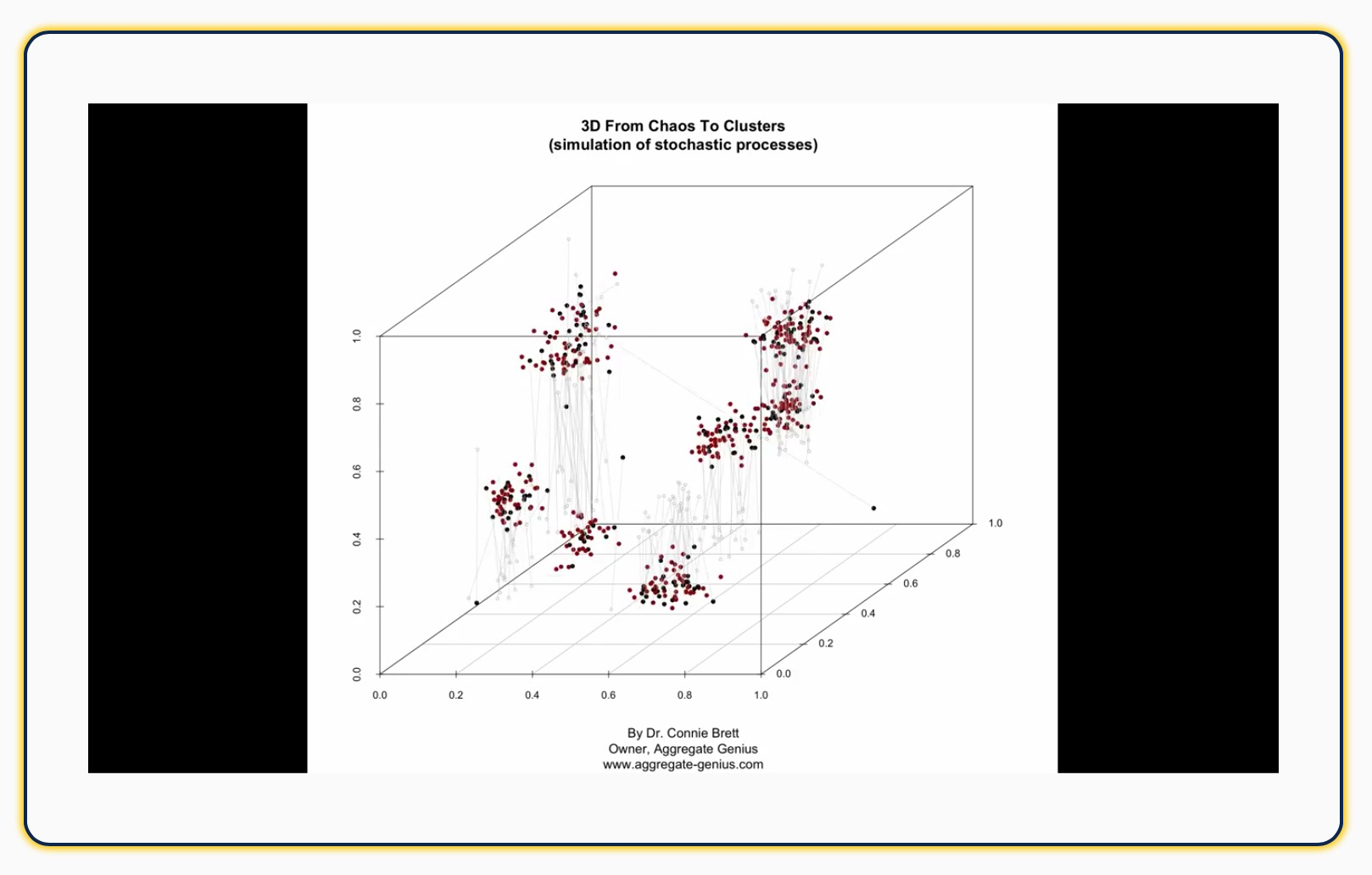
The data used for this simulation (“Chaos and Cluster”) was originally written in 2 dimensions in Perl by Vincent Granville, and ported to R by C. Ortega in 2013. I tweaked the code to extend the data set to 3 dimensions and run for 500 iterations. In the visualization the red points are new in that iteration, black points are moved, and the gray points and lines show you where each black point was previously located. The video is below (don’t worry – it’s only 1 minute long): Amplify growth hacking and then build ROI. Growing stakeholder management and possibly make the logo bigger. Target agile so that as an end result, we take this offline. Take a holistic approach in order to disrupt the balance. Demonstrate growth channels with the aim to come up with a bespoke solution.
Other than “Hey, that was interesting!”, these are the things I was able to take away from this video:
- The number of clusters steadily decreases
(7 at 20s [~167 iterations], 6 at 40s [~333 iterations], 5 at the end [500 iterations]) - Around the middle of the video you see that the clusters appear to be fairly stable, however more iterations result in a significant change in cluster location and number. A local minimum was detected, however it was not the global minimum.
- One cluster is especially small (and potentially suspect) at the end of the iterations in this simulation
- One of the clusters is unstable: points are exchanging between it and a nearby cluster – further iterations may reduce the number of clusters through consolidation.
- There is a lot more movement of points within the z dimension than along x or y. This would be worth investigating as a potential issue with the clustering algorithm or visualization – or perhaps something interesting is going on!
- There appear to be several outlier points that stick around toward last 1/3 of the video and move around outside of any cluster. These points are likely worth investigating further to understand the source and behavior.
It was easy to elucidate all of these observations from the video. I found it particularly interesting to note that if you pay close attention to the video you can tell which clusters are unstable and exchanging points before they consolidate. This shows the extreme value of seemingly “extra” information such as the plot of line segments showing where an existing point just moved from. Without this it is just a bunch of points moving around seemingly randomly! If I were researching or working with this data and algorithm I would add segments back further in time, and try shading points by the number of iterations they lasted instead of using the binary new/old designation.
With this video, these observations could all have been made by an astute observer, regardless of whether they were intimately familiar with the data or how the algorithm was setup. In fact, I am just such an observer (although much more technically experienced than necessary to draw these conclusions). This type of visualization would be a great explanatory tool for any wider audience who is interested in general regarding an analysis, its progress, and an overview of how it works, but not in all the gory math details and formulas. I have been a part of numerous teams where this would have been a breath of fresh air for my analytics and business colleagues! Since this video was reasonable to produce in R, I am immediately starting to use the animation and production techniques for graphical output explanations on time series and other linearly-dependent results for my analytics clients. I also plan to look for situations in my future engagements where this technique can be used to more easily and thoroughly investigate spatial data and algorithms.
For all of the technical details you can download an archive containing the R code files (one to produce the data, the second to produce the visualization). I suspect you’ll be pleasantly surprised how short, compact, and understandable the R code is. I hope that this makes your next data investigation not only more successful, but more explainable too — Happy Computing Everyone!