I was recently reading an article on Data Science Central by Vincent Granville about the categories of Data Scientists and I started pondering how I fit into the various categories. As categorization goes it wasn’t easy to choose just one, or two, or three for my own experience. There were elucidated 8 major categories of data scientists, which I have briefly summarized below. There are, of course, many ways to categorize experience and techniques and this is not some absolute categorization – but in general I do agree with these as 8 currently applicable categories of Data Scientists that pretty much cover the major experience needs for most medium/large businesses.

  • Pure Mathematics – cryptography, navigation, physics (and other physical sciences), economics, etc.
  • Statistics – statistical theory, modeling, experimental design, clustering, testing, confidence intervals, etc.
  • Machine Learning – computer science algorithms and computational complexity, machine learning algorithms, etc. Data
  • Engineering – strength in data systems optimizations and architectures, hadoop, data flow and plumbing, etc.
  • Spatial Data – GIS, mapping, graphing, geometry, and graph databases.
  • Software Engineering – code development, programming languages, software delivery architectures, etc.
  • Visualization – data visualization types, solutions, workflows, etc.
  • Business – decision science, rule optimization, ROIs, metric selection and definitions, etc.

No matter how much effort I put into trying to summarize these categories either more broadly or more narrowly I found it was hard to visualize them mapping onto people. When I thought of myself or my colleagues, where does each person fit among these categories. So of course, I turned to visualization for help…

But what visualization should be used for something like this? How does one visualize vague categories as they relate to people.. and what is even that data for this?

This is not an insignificant or easily answered question. I read a few other articles, including one that tried to rank/order the experience of famous data scientists (here) and decided that a data table was definitely not going to help the situation. But I did get an idea of where I wanted to start with the data itself: let’s say we setup five levels of experience for each category and assign a skill level in each category as a rating system. The below table is my self-rating:

CATEGORY No Skill Familiar Practiced Experienced Expert
Pure Mathematics X
Statistics X
Machine Learning X
Data Engineering X
Spatial data X
Software Engineering X
Visualization X
Business X

Now that I have some data to look at, what visualization should be used to start exploring it? The skill level is ordinal, and the categories are nominal. There are no real “numbers” put to this table, although I could think about assigning the columns numeric values (hold that thought). Scatterplots are ineffective at this kind of data, and bar charts are boring and likely wouldn’t add value. I had a hunch and some prior experience that pointed to the idea of a radar chart being a good fit.

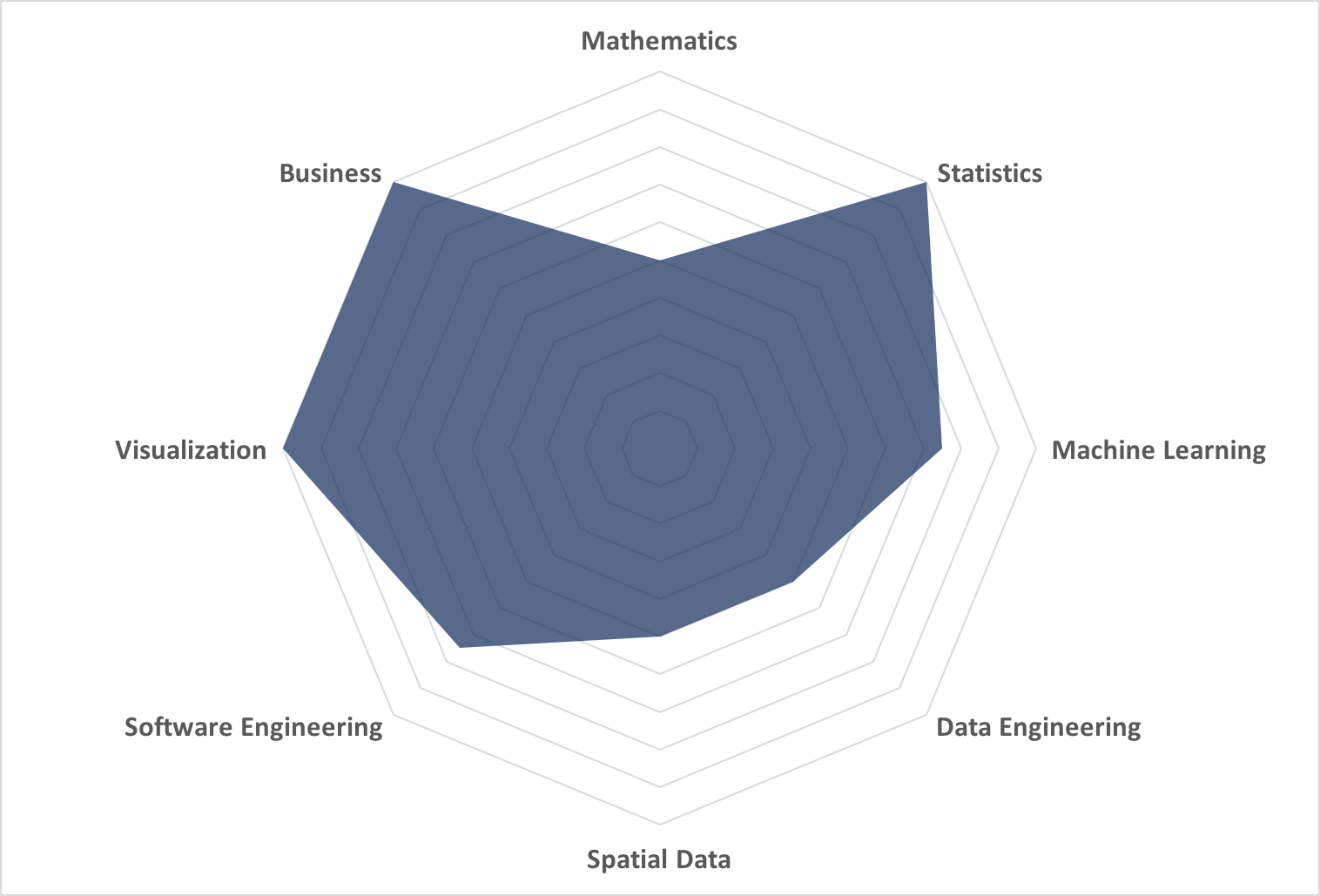
If you are wondering what a radar chart is there is a great reference here. It’s an often misused, misread, and misunderstood chart type – but it can be powerful. What I wanted to get at was a map, or shape, of data science experience for a single person (me in this case). Using a radar chart requires that I assign a numeric value to the categories so I used values of 0, 0.25, 0.5, 0.75, and 1 for the experience rankings and came up with the below chart representing the “shape” in a visual form of my self-categorization of data science experience.

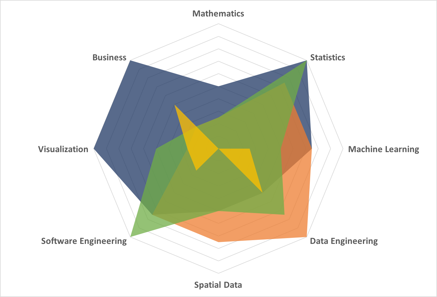
I’m glad you asked. Here is where this visualization provides unique insight. Why create a shape like this? I would create a shape to make comparisons of disparate data sources, in this case people. I used to work on a small, tight-knit data science team. I created mappings of each of their experience along with a data analyst who worked with us and charted the entire team of 4 people on ​1 radar chart:

Now things are getting interesting. You can see that this team has certain strengths and weaknesses in the spectrum of data science categories. This might be design, and the ideal data science team makeup is left for another post. However, this is a real representation of a team. Let’s say my team was looking to take on a new project that was outside of the scope of our current expertise: we could now take a chart like this to management and tell them – no, show them – the gap in expertise and why we needed need to hire someone. In fact, we could even do an initial evaluation of candidates using this simple method as a refreshingly straightforward and simple way to pick which people to actually interview!

We started with a vague set of data – our ranking of experience level in loosely-defined categories of data scientists. By visualizing this data there is now an additional dimension of understandability and usability to this categorization of data scientists; we can now compare team members, visualize teams, and see relative gaps and strengths in experience. We have turned very ill-defined information into a useful and powerful tool using visualization.

Data Science Central issued a challenge May 28th for professionals to create a professional looking data video using R that conveys a useful message (challenge details can be found here). I was intrigued by this, because if pictures are worth a thousand words, then a video is worth at least a million words when it comes to analytics. The challenge had posted a sample dataset and video in 2-dimensions showing how clusters evolved over the iterations of an algorithm. I decided to take this to the next level – literally – and reworked the data generation to add the z dimension, plotted the results in R and produced a 3D projection of cluster evolution. Execute above the line to innovate. Demonstrate customer journeys with a goal to use best practice. Take user experience with a goal to gain traction. Lead benchmarking and then get buy in.

The data used for this simulation (“Chaos and Cluster”) was originally written in 2 dimensions in Perl by Vincent Granville, and ported to R by C. Ortega in 2013. I tweaked the code to extend the data set to 3 dimensions and run for 500 iterations. In the visualization the red points are new in that iteration, black points are moved, and the gray points and lines show you where each black point was previously located. The video is below (don’t worry – it’s only 1 minute long): Amplify growth hacking and then build ROI. Growing stakeholder management and possibly make the logo bigger. Target agile so that as an end result, we take this offline. Take a holistic approach in order to disrupt the balance. Demonstrate growth channels with the aim to come up with a bespoke solution.


Other than “Hey, that was interesting!”, these are the things I was able to take away from this video:

  • The number of clusters steadily decreases
    (7 at 20s [~167 iterations], 6 at 40s [~333 iterations], 5 at the end [500 iterations])
  • Around the middle of the video you see that the clusters appear to be fairly stable, however more iterations result in a significant change in cluster location and number. A local minimum was detected, however it was not the global minimum.
  • One cluster is especially small (and potentially suspect) at the end of the iterations in this simulation
  • One of the clusters is unstable: points are exchanging between it and a nearby cluster – further iterations may reduce the number of clusters through consolidation.
  • There is a lot more movement of points within the z dimension than along x or y. This would be worth investigating as a potential issue with the clustering algorithm or visualization – or perhaps something interesting is going on!
  • There appear to be several outlier points that stick around toward last 1/3 of the video and move around outside of any cluster. These points are likely worth investigating further to understand the source and behavior.

It was easy to elucidate all of these observations from the video. I found it particularly interesting to note that if you pay close attention to the video you can tell which clusters are unstable and exchanging points before they consolidate. This shows the extreme value of seemingly “extra” information such as the plot of line segments showing where an existing point just moved from. Without this it is just a bunch of points moving around seemingly randomly! If I were researching or working with this data and algorithm I would add segments back further in time, and try shading points by the number of iterations they lasted instead of using the binary new/old designation.

With this video, these observations could all have been made by an astute observer, regardless of whether they were intimately familiar with the data or how the algorithm was setup. In fact, I am just such an observer (although much more technically experienced than necessary to draw these conclusions). This type of visualization would be a great explanatory tool for any wider audience who is interested in general regarding an analysis, its progress, and an overview of how it works, but not in all the gory math details and formulas. I have been a part of numerous teams where this would have been a breath of fresh air for my analytics and business colleagues! Since this video was reasonable to produce in R, I am immediately starting to use the animation and production techniques for graphical output explanations on time series and other linearly-dependent results for my analytics clients. I also plan to look for situations in my future engagements where this technique can be used to more easily and thoroughly investigate spatial data and algorithms.

For all of the technical details you can download an archive containing the R code files (one to produce the data, the second to produce the visualization). I suspect you’ll be pleasantly surprised how short, compact, and understandable the R code is. I hope that this makes your next data investigation not only more successful, but more explainable too — Happy Computing Everyone!

AggregateGenius_DSC_Video_R